Menu
Menu
Comparing India's energy, economic growth, and emissions futures through the lens of climate policy models
Most modelling studies use different climate policy models and varying input assumptions, which leads to varying and occasionally conflicting results. Recognising the uncertainties in future pathways, here we compare the results of various studies along several parameters. The aim of doing this is to illustrate the range of possibilities explored, the potential implications of these divergences, and the common trends and storylines that emerge across models.
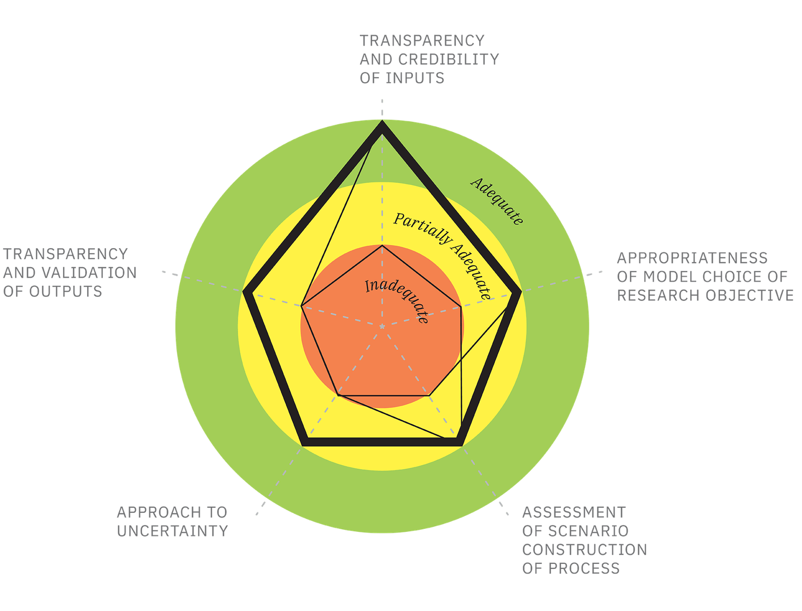
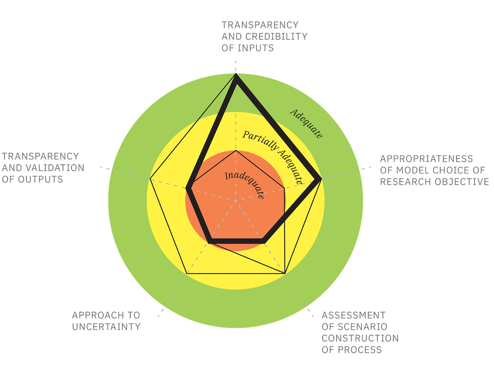
ROBUSTNESS OF MODELLING EXERCISE AS PER THE
CLIMATE FUTURES PROJECT ASSESSMENT FRAMEWORK
CLIMATE FUTURES PROJECT ASSESSMENT FRAMEWORK
TERI-SHELL
IEA
CEEW
McKinsey
TERI-SHELL

IEA
CEEW
McKinsey

An explanation of relative performance of models along 5 assessment parameters
In general, the robustness of any modelling exercise rests upon five parameters: transparency and validity of inputs, appropriateness of model choice, quality of scenario construction process, treatment of uncertainties, and validation of outputs. Under current practices and data limitations, not all modelling setups perform equally along all five parameters; they demonstrate different strengths and shortcomings.
PROJECTED EMISSIONS, GDP GROWTH, AND
PRIMARY ENERGY DEMAND
PRIMARY ENERGY DEMAND
Scelerisque ullamcorper. Metus pede lorem erat magnis quis morbi sagittis auctor vitae dui, id dolor. Hac elementum ridiculus justo pulvinar maecenas pulvinar. Nibh ad faucibus, porta molestie iaculis facilisi at nec fringilla proin quam volutpat congue amet platea suspendisse, conubia parturient.
Scelerisque ullamcorper. Metus pede lorem erat magnis quis morbi sagittis auctor vitae dui, id dolor. Hac elementum ridiculus justo pulvinar maecenas pulvinar. Nibh ad faucibus, porta molestie iaculis facilisi at nec fringilla proin quam volutpat congue amet platea suspendisse, conubia parturient.
Scelerisque ullamcorper. Metus pede lorem erat magnis quis morbi sagittis auctor vitae dui, id dolor. Hac elementum ridiculus justo pulvinar maecenas pulvinar. Nibh ad faucibus, porta molestie iaculis facilisi at nec fringilla proin quam volutpat congue amet platea suspendisse, conubia parturient.
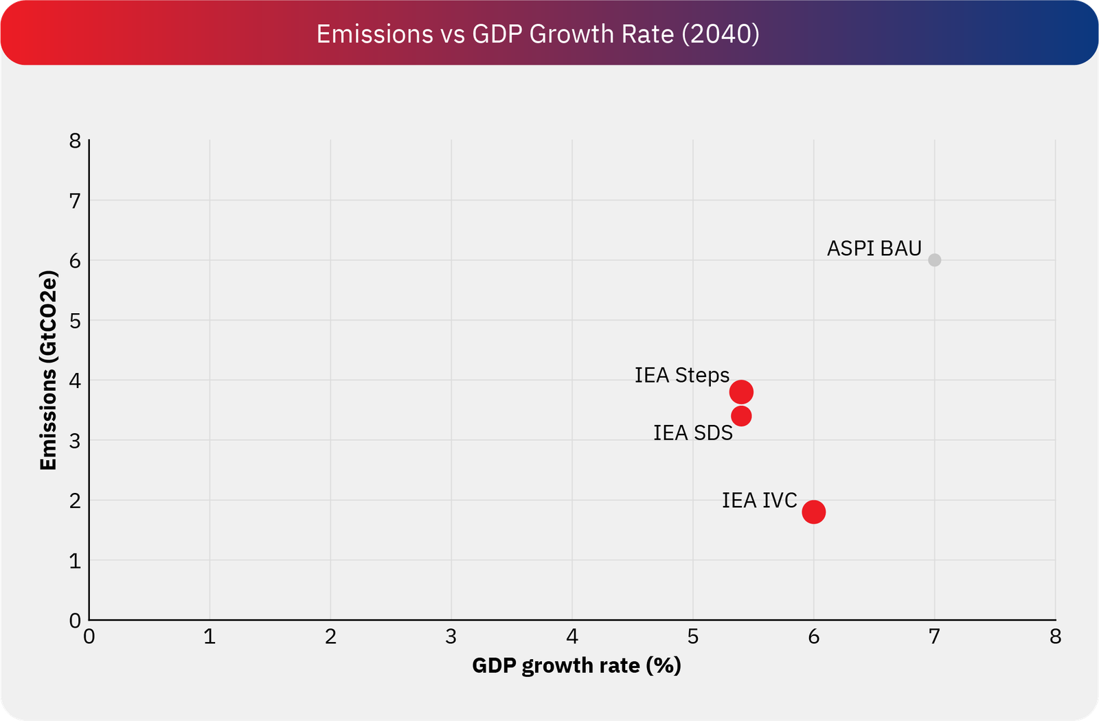
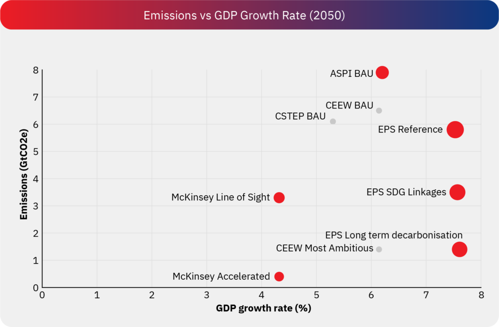
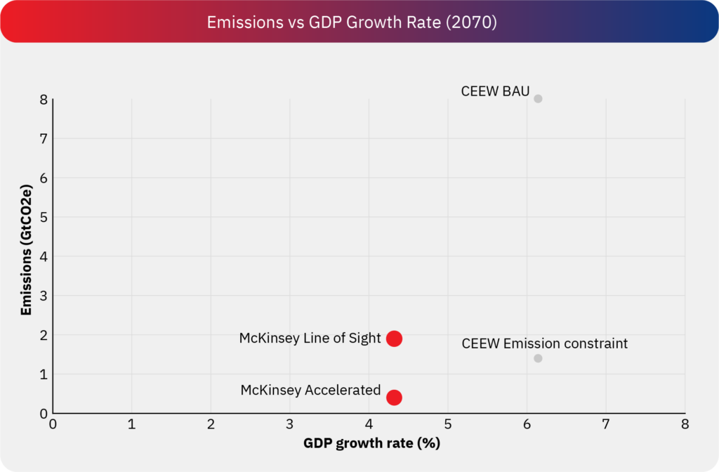
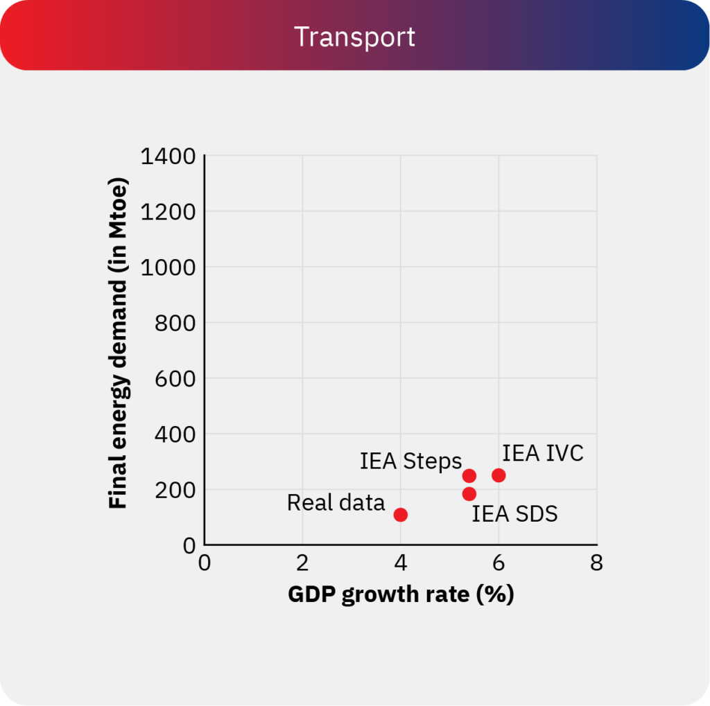
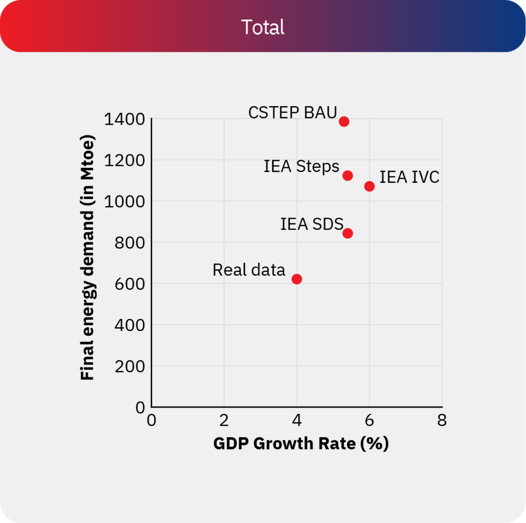
1. What can we observe from this graph?
This graph illustrates the projected emissions in the final year of the projection period relative to the average GDP growth rate from the base year to the end year for each scenario covered. The size of the bubble denotes the primary energy demand in the end year, a grey bubble denotes unavailability of data of the respective modelling study.
IEA’s exploratory projections suggest that by 2040, annual emissions could range between approximately 1.8 to 4 GtCO₂, assuming GDP growth rates of 5–6% across various scenarios. Emissions under the STEPS and IVC scenarios remain relatively close to current levels, whereas emissions under the SDS scenario align more closely with mid-century decarbonization objectives. In contrast, ASPI’s projections indicate annual emissions between 2.2 and 6 GtCO₂ in 2040, with an assumed annual GDP growth rate of 7% under the BAU scenario.
For projections extending to 2050, CEEW assumes a higher average GDP growth rate of 6.14%. Similarly, while EPS projects a growth rate of approximately 7.5%, with annual emissions ranging between 1.4 and 5.8 GtCO₂, its reference scenario has the highest primary energy demand of 3828 Mtoe.
Meanwhile, McKinsey and CSTEP adopt more conservative assumptions, reflecting both lower GDP growth rates and annual emissions.
2. What can we infer from this graph?
This graph illustrates the projected extent of decarbonization (without accounting for carbon dioxide removal) at the corresponding growth rates. While final energy demand is more relevant for demand-side strategies, primary energy demand is useful for understanding supply-side efficiency, energy mix shifts, and system-wide decarbonization progress. These projections also indicate that significant decarbonisation is feasible under the growth rates, low-carbon policies, and technological-feasibility assumptions of each of these models.
FINAL ENERGY DEMAND VS. GDP Growth rate,
BY SECTOR
BY SECTOR
Scelerisque ullamcorper. Metus pede lorem erat magnis quis morbi sagittis auctor vitae dui, id dolor. Hac elementum ridiculus justo pulvinar maecenas pulvinar. Nibh ad faucibus, porta molestie iaculis facilisi at nec fringilla proin quam volutpat congue amet platea suspendisse, conubia parturient.
Scelerisque ullamcorper. Metus pede lorem erat magnis quis morbi sagittis auctor vitae dui, id dolor. Hac elementum ridiculus justo pulvinar maecenas pulvinar. Nibh ad faucibus, porta molestie iaculis facilisi at nec fringilla proin quam volutpat congue amet platea suspendisse, conubia parturient.
Scelerisque ullamcorper. Metus pede lorem erat magnis quis morbi sagittis auctor vitae dui, id dolor. Hac elementum ridiculus justo pulvinar maecenas pulvinar. Nibh ad faucibus, porta molestie iaculis facilisi at nec fringilla proin quam volutpat congue amet platea suspendisse, conubia parturient.
Scelerisque ullamcorper. Metus pede lorem erat magnis quis morbi sagittis auctor vitae dui, id dolor. Hac elementum ridiculus justo pulvinar maecenas pulvinar. Nibh ad faucibus, porta molestie iaculis facilisi at nec fringilla proin quam volutpat congue amet platea suspendisse, conubia parturient.
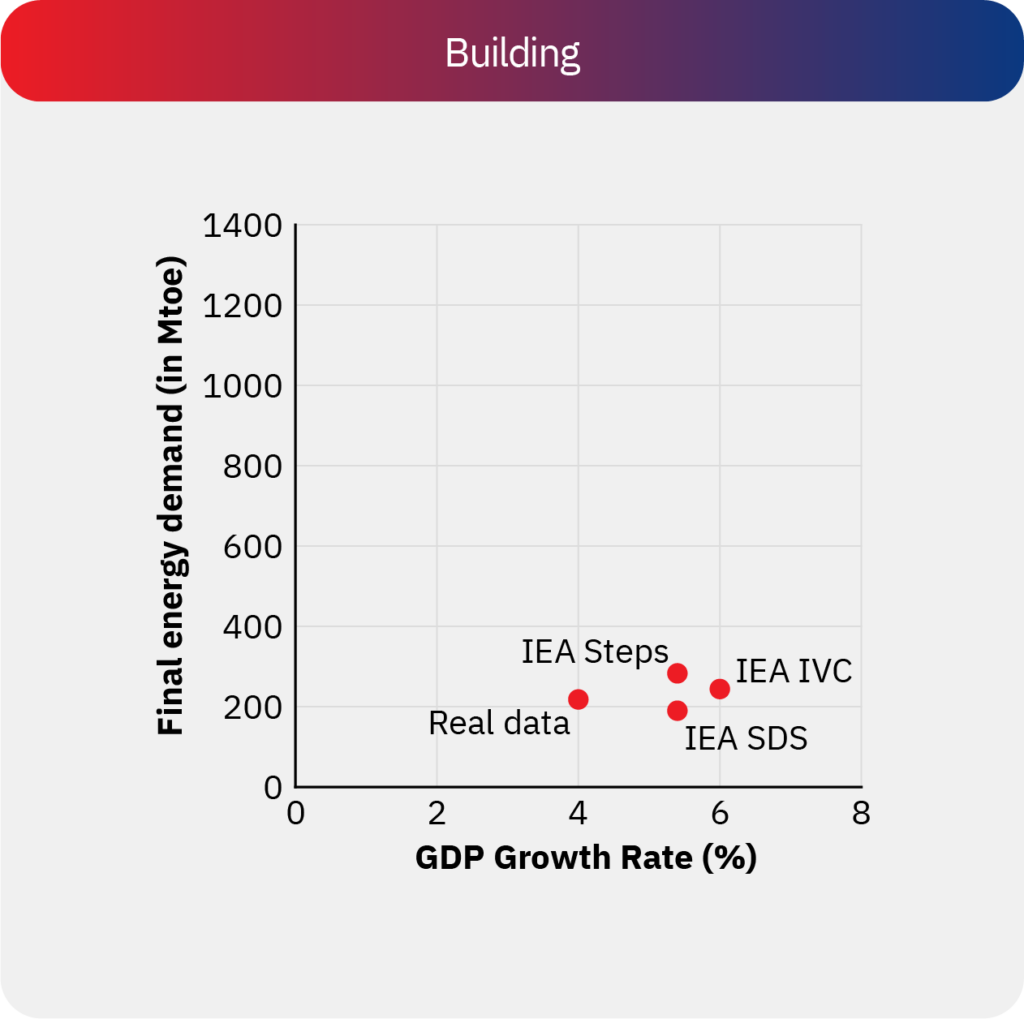
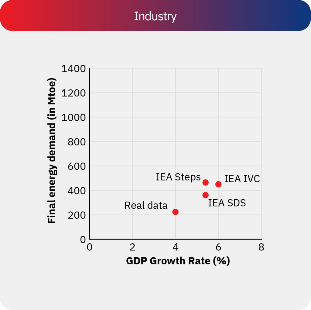
1. What can we observe from this graph?
This graph shows the current (2019) and projected ‘final energy demand’ along the vertical axis, and the corresponding projections of GDP growth rate along the horizontal axis. The points are classified by sectors, indicated in the 4 panels: Buildings, Industry, Transport, and Total. Unfortunately, only the IEA study presented the data in this form, and comparable data was not available from the other studies.
Building energy demand is relatively constant across IEA scenarios, and does not increase materially above current estimates, indicating successful demand side measures offsetting the increase in building stock and the swapping of newer energy sources for traditional biomass. Transport energy demand increases marginally. However, increases are seen in industrial and therefore total energy demand.
2. What can we infer from this graph?
According to the IEA (2021) study, industry and transport sectors are projected to contribute the most to increased energy demand, while the building sector is expected to contribute the least. In terms of policy design, this indicates a strong role for policies related to demand reduction and energy efficiency in the building sector, and a smaller projected scope for such policies in the industry, transport sector.
Data was unavailable in a comparable format across the other studies analysed, which limited our ability to corroborate these inferences. Since sectoral demand projections are crucial for designing the aforementioned policies, we recommend that results across future studies be similarly disaggregated.
INSTALLED ELECTRICITY CAPACITY (GW)
IN END-YEAR
IN END-YEAR
Scelerisque ullamcorper. Metus pede lorem erat magnis quis morbi sagittis auctor vitae dui, id dolor. Hac elementum ridiculus justo pulvinar maecenas pulvinar. Nibh ad faucibus, porta molestie iaculis facilisi at nec fringilla proin quam volutpat congue amet platea suspendisse, conubia parturient.
Scelerisque ullamcorper. Metus pede lorem erat magnis quis morbi sagittis auctor vitae dui, id dolor. Hac elementum ridiculus justo pulvinar maecenas pulvinar. Nibh ad faucibus, porta molestie iaculis facilisi at nec fringilla proin quam volutpat congue amet platea suspendisse, conubia parturient.
Scelerisque ullamcorper. Metus pede lorem erat magnis quis morbi sagittis auctor vitae dui, id dolor. Hac elementum ridiculus justo pulvinar maecenas pulvinar. Nibh ad faucibus, porta molestie iaculis facilisi at nec fringilla proin quam volutpat congue amet platea suspendisse, conubia parturient.
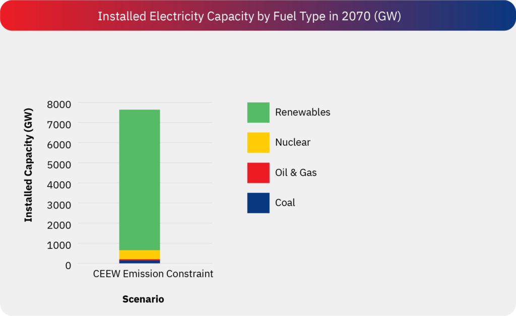
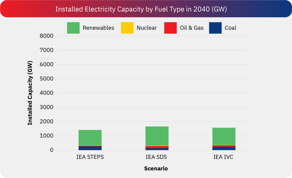
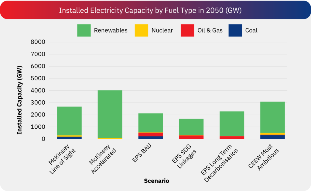
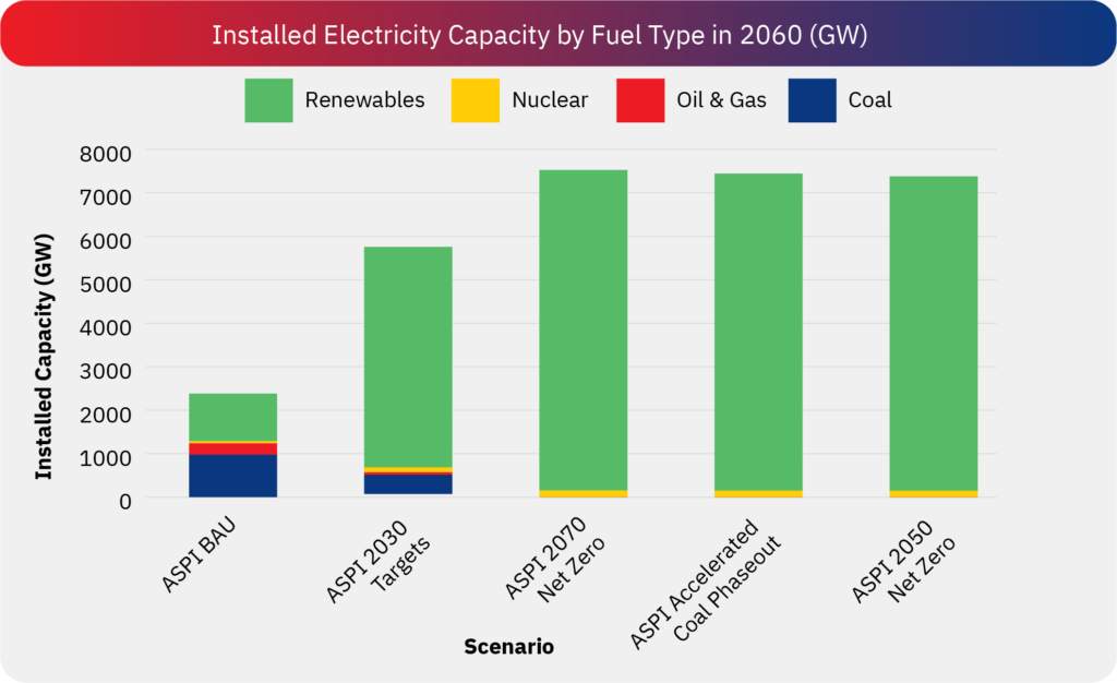
1. What can we observe from this graph?
This graph shows the electricity capacity (in GWs) along the vertical axis, and study-scenario instances along the horizontal axis. The bar graphs indicate the total capacity in each scenario, and the colours within represent different generation technologies.
Installed electricity capacity increases from appr. 1500 GW in the 2040 scenarios to, and further to appr. 7000 GW in the 2070 scenarios. Much of the increase in capacity is driven by renewable capacity, with declines seen in coal and oil and gas capacity over time. We also observe that while all three studies concur regarding the key role of renewable energy, there is far less consensus regarding technologies which can viably provide flexible or firm sources of low-carbon power to balance out the intermittency of renewable energy. While IEA highlights the role of batteries, TERI-Shell is hopeful of hydrogen-based technologies, and CEEW cautiously considers roles for carbon capture and storage, or hydrogen across various scenarios.
2. What can we infer from this graph?
The primary technologies for decarbonisation of the energy sector are expected to be solar and wind, their shares increasing substantially with time. Uncertainties in the projections increase with time, and arise primarily from the unknown technical and economic viability of carbon capture and storage (CCS) and hydrogen-based technologies. Consensus across the studies indicates a strong role for policies to strengthen the solar and wind technologies and related manufacturing, while addressing related issues of justice and equity as employment and revenue sources shift. Uncertainty regarding emerging technologies indicates a more nuanced role – hedging risks and leveraging opportunities – across policies related to innovation, research, development, and even possibly large-scale deployment.
ELECTRICITY GENERATION BY FUEL SOURCE
IN END-YEAR
IN END-YEAR
Scelerisque ullamcorper. Metus pede lorem erat magnis quis morbi sagittis auctor vitae dui, id dolor. Hac elementum ridiculus justo pulvinar maecenas pulvinar. Nibh ad faucibus, porta molestie iaculis facilisi at nec fringilla proin quam volutpat congue amet platea suspendisse, conubia parturient.
Scelerisque ullamcorper. Metus pede lorem erat magnis quis morbi sagittis auctor vitae dui, id dolor. Hac elementum ridiculus justo pulvinar maecenas pulvinar. Nibh ad faucibus, porta molestie iaculis facilisi at nec fringilla proin quam volutpat congue amet platea suspendisse, conubia parturient.
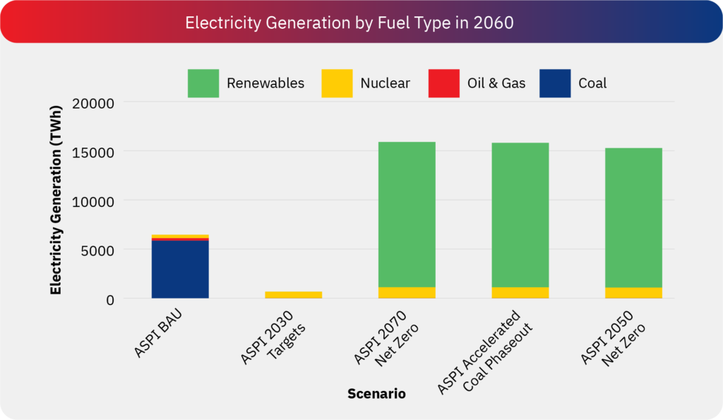
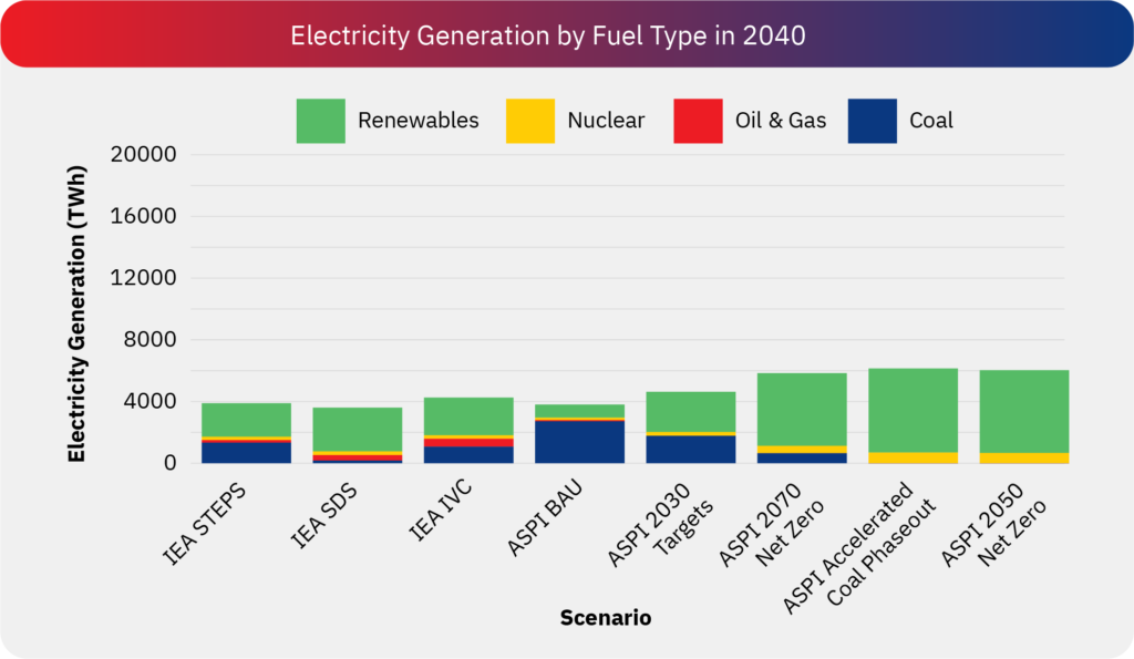
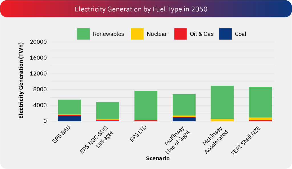
1. What can we observe from this graph?
This graph highlights the total electricity generation in the projected end year for each scenario, stacked by the generation source.
In IEA’s 2040 scenarios, projected electricity generation ranges between 3,601 TWh and 4,254 TWh. Similarly, ASPI’s projections for the same period estimate electricity generation between 3,885 TWh and 6,271 TWh. In contrast, TERI-Shell’s 2050 scenario projects electricity generation at 8,800 TWh (with estimates for 2040 below 6,000 TWh, though not shown), nearly twice as high as IEA’s projections. Notably, while wind and solar account for approximately half of total generation in IEA’s 2040 scenarios, they contribute nearly 90% of total generation in TERI-Shell’s 2050 scenario. Additionally, nuclear energy appears to play a more prominent role in IEA’s 2040 projections compared to TERI-Shell’s 2050 scenario.
McKinsey’s Accelerated and Line of Sight scenarios project electricity generation at 8,920 TWh and 6,846 TWh, respectively. EPS’s SDG Linkages scenario estimates electricity generation at 4,940 TWh, whereas its Long-Term Decarbonisation scenario projects 7,822 TWh. Meanwhile, CSTEP presents more conservative estimates, ranging from 3,908 TWh to 4,600 TWh. Unfortunately, comparable electricity generation values were not available in the CEEW study.
2. What can we infer from this graph?
The projections indicate significant variation in total electricity demand, driven by differing assumptions on economic growth, electrification, and efficiency measures. IEA’s 2040 estimates range from 3,601–4,254 TWh, while ASPI and TERI-Shell project much higher values, with TERI-Shell reaching 8,800 TWh by 2050. McKinsey, EPS, and CSTEP present diverse estimates, reflecting different decarbonization strategies. The technology mix also varies—wind and solar contribute about 50% in IEA’s 2040 scenarios but nearly 90% in TERI-Shell’s 2050 outlook, while nuclear plays a larger role in IEA’s projections. Lower electricity demand in some scenarios suggests a stronger focus on efficiency and demand-side management, while higher projections assume rapid electrification and economic expansion. Ultimately, the feasibility of different decarbonization pathways will depend on balancing renewables, nuclear, storage, and grid flexibility, alongside effective energy efficiency measures.
FUTURE DIRECTIONS FOR CLIMATE POLICY MODELLING
FUTURE DIRECTIONS FOR CLIMATE POLICY MODELLING
FUTURE DIRECTIONS FOR CLIMATE POLICY MODELLING
Despite their insights about the magnitude of transformations required, models say little about whether the transformations are actually feasible. Transformations of technological systems also need socio-economic reorganisations, involving decisions across a wide range of actors with diverging interests, resources and capabilities, and their interactions. Similarly, innovation processes are characterised by complex, hard-to-predict, emergent non-linear dynamics. Finally, mainstream economic systems have led to both increasing inequities and climate change, with feedback effects between them. However, such characteristics are rarely accounted for in mainstream emissions-economy or energy systems models, which present aggregate, simple representations of governance and economic systems.
Given these challenges, and building upon our analysis, we suggest two broad avenues for improvements to modelling going forward.
In the short term, there is a need for modelling exercises to be more transparent about modelling structures and input assumptions. The role of uncertainties – in technology costs, economic structures, resource constraints, among others – should be discussed more robustly. Modelling studies should undergo rigorous review and should clearly explain how their outputs may best be considered. This will also require a more collaborative engagement among the modelling community.
In the longer term, the underlying models themselves should be upgraded to reflect circumstances that are unique to developing country contexts, including the role of the informal economy. Additionally, they should be able to reflect equity and distributional impacts, for instance through integration with micro- and geospatial models. This will help better inform a just transition and will yield lessons for subnational policymaking.